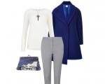
Combination of bright blue color. Blue color in clothes - style and elegance in one combination
Dark navy blue is a lifesaver for most people who don't want to wear a gloomy black color. It is no less universal than black, but has one undeniable advantage - it is not without color tone. That’s why it often looks more interesting in a wardrobe.Dark shades of blue represent peace and stability. When a person looks at things of this shade, his pulse, blood pressure, and breathing rate decrease. The body adjusts to calm and rest.
Such shades are often associated with military uniforms, and therefore a person wearing dark blue is perceived as strict and disciplined. That is why dark blue is very popular in business style.
The deep blue color is more winter than summer. This may be due to the fact that dark matter products become very hot in the sun. Or maybe the perception of color itself, its psychological impact, also plays a role here. After all, it is during the cold season that we want solitude and peace more.
Combinations with dark blue should be based on the principle of contrast in lightness and/or saturation. Because This is a dark and low-saturated color, then next to it light and/or bright shades will sparkle with colors. Ensembles made in a combination of dark blue with another dark shade can hardly be called harmonious. Most often they leave a feeling of gloom.
The combination of white and dark blue creates a strict, but at the same time, elegant look. This set will be especially good for business attire. It will tune you into the work wave and will not distract you. The combination of these colors is universal and is suitable for both a set for every day and for an official or special event.
Instead of white, you can use gray. But here you should pay attention to a lighter shade of gray, otherwise the feeling of the set may be depressing. This look will also look strict, but, unlike a combination with white, a good solution would be to introduce a third shade as an accent.

Pink looks interesting and playful next to dark blue. At the same time, the dark blue itself fades into the background and becomes the background for pink, revealing its brightness and purity.

The combination of purple and dark blue is very elegant. In these colors, an evening outfit will look luxurious and noble. Tonally, these colors are close to each other, and their combination creates a noble image.

Pair dark blue with soft shades of brown for a great everyday ensemble. These two colors can be combined in different proportions, each time creating a new impression. In any case, you will look calm and confident. If you want to create a festive outfit in a similar color scheme, choose beige accessories for a dark blue dress.

The sets where dark blue is combined with green are bright and interesting. Moreover, the shade of green can be any. The combination with olive will be harmonious and balanced, and with mint it will be fresh and original. The emerald shade of green together with dark blue will create a rich and noble ensemble.

When dark blue is combined with bright warm shades - yellow, red and orange - the cheerfulness and dynamics of such tandems are emphasized. Yellow will further enhance the depth of blue. The combination with red is quite sharp and heavy; it is better to balance it, for example, with white. With orange and coral, dark blue will look soft and delicate.

Add gold or silver details to your dark blue outfit. They will play even brighter. Gold will look warmer and shinier, while silver will look even more elegant. This is a great option for a party.
In short, blue color can be described as calm and noble. The secret is that blue shades go with almost everything. This is an alternative to the universal black color. It’s not for nothing that fashion designers adore the combination of blue in clothes!
What color does blue go with?
As mentioned above, thanks to the versatility of the color palette, you don’t have to rack your brains over what color blue goes with. However, some duets look brighter and more original.
Blue with red
The combination of blue and red is one of the most beloved in the fashion world. A red fitted blazer and a pair of high heels can completely transform a pair of plain blue jeans. This outfit is suitable for both a loyal office dress code and a party.
Well, is it possible to pass up a classic Breton striped shirt? This wardrobe item further enhances the brightness of a red blazer and the contrast of blue jeans, enveloping you in true French chic.

Blue with turquoise
Among the colors combined with blue, turquoise occupies a special place. Together they are a very powerful and vibrant duo. To appreciate all its elegance and grace, just remember the movie “Breakfast at Tiffany’s”. It is not at all necessary to dilute this strong pair with a neutral shade (for example, white or), it will be enough to focus on silver or gold accessories. It all depends on your taste and personal preferences.

Blue and orange
If you choose what to combine blue with, you can’t help but mention the perfect color combination of blue and orange. Blue trousers and an orange top are a great outfit that will refresh a girl of any type of appearance. The combination of dark blue with orange things looks completely different (but no less beautiful). Whatever look you prefer, pay special attention to shoes. Nude shoes or ballet flats are the best choice, which will not only perfectly complete your look, but will also wonderfully tie all its elements together.

What goes with a blue dress: choice of shoes, jewelry and outerwear
The blue color is quite bright on its own, so despite its versatility, you should be very careful when selecting additional items and accessories.
Shoes
The first thing you should take care of is, of course, shoes. You can't go wrong if you choose neutral shoes - beige or black - to pair with a deep blue dress. More elegant colors - gold or silver - will look no less good.
Actually, nude is the ideal color option for all accessories matched to a blue dress. Therefore, a beige clutch is another win-win wardrobe element that will perfectly complement any of your looks.

The same applies to black and white items. The elegant contrast of black shoes and a bag with a blue dress looks especially good. The same option is suitable for those who do not know what color a dark blue outfit goes with.

If you like a very rich blue color, carefully combine it with other bright colors. This does not mean that such combinations should be abandoned altogether: just try to keep the blue color dominant, and additional colors play only a secondary role. For example, what does dark blue go with? Its frame in mustard or yellow looks very nice. Well, a bright blue shade looks great paired with pink or the same yellow color.

With a black dress
A blue coat looks quite elegant and sophisticated, so you can safely wear it to some important event. A little black dress, high-heeled shoes and neat jewelry will help you look like a lady. This is the option when you need to look modest but stylish. To avoid looking too mournful, it is better not to combine a black dress with a dark blue coat.

With things in a neutral color palette
To look cute and very romantic, you just need to create a combination of a blue coat and things in neutral shades (beige, white, pale pink), complementing the resulting look with nude accessories. Concentrating all the attention around the coat, this look is associated with lightness and freshness.

(Viewed 1 time, 1 visits today)
Selecting a color scheme is quite a responsible task. The combination of colors in design has always been one of the main tasks. Be sure to pay attention to color combinations, it's important!
The color scheme should not strain or irritate you in any way, but, on the contrary, restore the harmony lost during the day. Choosing a color scheme begins with deciding what you really want from a color design. This is the only way you can choose the optimal color combination.
The “hottest” color is orange. The coldest is blue, always associated with cool water and ice. Moving from blues through greens and yellows, the colors warm up, hold a “high temperature” in red, burgundy, brown and some shades of pink and purple, and then “descend” again to the cold through lilac and blue. However, the presented gradation is very arbitrary, since the boundaries between cold and warm are barely perceptible. For example, lime is more of a yellow color, but is a cool color. Conversely, deep, rich purple can be either warm or cool, depending on whether it is dominated by red or blue.
And yet, it is warm or cold palettes that can transform a room. So, for example, in order to expand the walls of a small room, it is advisable to use not just light, but light, cold tones.
Conversely, warm shades will help make an overly spacious and therefore empty room more comfortable. They will also add a little sunny mood if there is not enough natural lighting and fluorescent lamps are used. Whereas a richly lit room with large windows can be “dressed up” in cool colors.
The color schemes of kitchen interiors are particularly wide. If you are decorating a kitchen, you should take into account that rich warm colors - orange, grass green, egg yellow - increase appetite, while blue and white help to keep yourself within limits and eat food in moderation.
The bedroom - be it a corner for relaxation from the harsh everyday life or the very embodiment of romance - also requires a special approach. In the first case, it is better to paint it in cool colors that take you far from the problems that need to be solved. In the second, of course, the first roles belong to red and all its various shades, or any other color that you like and belongs to the warm range. This color will allow you to quickly restore strength, as if transferring its energy and warmth to you. Color combination rules
Of course, there are trendy color combinations for every season. But when you select color combinations, you should still rely on the color combination table and your own feelings.
There is no right color combination, only a good color combination.
In order to select color combinations, there are several approaches. The first type is plain
The color scheme varies within the main color, it only becomes darker or lighter. For example, dark blue, blue, light blue. However, a room decorated in this way can be slightly diluted with “splashes” of a different color that does not attract too much attention. For example, a room in blue and blue tones can be complemented by white and light sand. The second type is harmonious
If you want variety, but not so radical as to talk about contrasts, “paint” the room with a harmonious combination of colors. The most winning examples of color combinations that can be safely combined with each other:
- For red: pink - purple and orange - egg yellow
- For orange: red - pink and egg yellow - yellow
- For yellow: orange - egg yellow and lime - light green
- For green: lime - light green and aqua - blue
- For blue: green - sea green and lilac - purple
- For purple: blue - lilac and pink - red
The third type is a game of contrasts
For lovers of original and bright design - a game of contrasts. Each color on the palette has its own “antipode”:
- Red – green
- Orange - sea green
- Egg yellow – blue
- Yellow – lilac
- Lime – purple
- Light green - pink
Even if it seems to you that you don’t react to color in any way (you don’t care at all what color the objects around you are), your eye catches its slightest shades (up to one and a half million!), and your subconscious and genetic memory record all the color “messages” .
As a result, being in a certain color scheme of rooms invisibly guides your emotions and actions.
“Unfavorable” colors and color combinations
Red – creates nervous tension (can even cause hypertension).
Black (and also purple) “eats up” space.
Brown (including wood-like finishes) - causes melancholy and can lead to depression.
Gray - sadness and despondency.
Blue – a feeling of cold and discomfort. Favorable colors
- Shades from yellow to green are a calm and optimistic range that relieves fatigue.
- Pastel shades from yellow to beige are “reconciling” and comfortable colors.
- Turquoise – gives a feeling of freshness (suitable for the bathroom).
- Light blue - calms, causes drowsiness - ideal for bedrooms and rest rooms, but is contraindicated in offices and work areas.
- Dark blue – “cools” space and ardor (for example, at the negotiating table), is considered a serious and business-like color.
- Yellow and orange – stimulates and tones (not suitable for a bedroom), suitable for a room with windows facing north.
- White can cause a feeling of cold and discomfort, on the other hand, a “clean sheet” is an ideal background for any design solutions. Red or terracotta as accents are invigorating and uplifting.
- Black as accents gives the interior a graphic and special style.
- Light gray in a “mix” with other colors is a business environment.
Combinations of related and contrasting colors represent the most extensive type of color harmonies. In the color wheel system, related and contrasting colors are located in adjacent quarters. These are: warm (yellow-red and yellow-green colors) and cold (blue-green and blue-red colors).
Particularly harmonious are color combinations that are located on the color wheel at opposite ends of each other. This is explained by the fact that there is a double connection between such pairs of related-contrasting colors: they consist of an equal amount of the unifying main color and equal amounts of contrasting colors. In practice, you rarely come across compositions that contain only two colors. The simplest harmonious combination of two related and contrasting colors is significantly enriched by adding a color from the tonal range of the same colors, whitened or darkened.
Also, color harmony can be formed by a combination of colors located at the vertices of an equilateral triangle inscribed in the color circle. By rotating such a triangle inside a circle, you can get any combination of colors, and it will definitely be harmonious. A successful combination of colors and paints in the interior is the key to comfort in the home.
Color combinations in clothes are a very important point when choosing a wardrobe, designing a new knitting model. Harmonious means well-matched in combination.
- The harmony of colors in clothing is based on the principle of combining related or contrasting colors. In clothing we can talk about harmonious combinations based on shades of the same color, then this is one-color harmony.
- Harmony can be built on a combination of close colors, i.e. adjacent colors of the color wheel, for example, yellow and yellow-orange, orange and red-orange.
- Harmony can be built on contrasting colors. This means that colors are selected from adjacent sectors of the color wheel. Colors located at an angle of 90° in adjacent sectors combine best with each other. Another type of contrasting harmony is combinations of colors that are at an angle of 180° to each other in the color wheel.

The main colors are considered to be 4 pure colors: yellow, red, blue, green. All others are considered intermediate (yellow-red, yellow-green, green-blue, blue-red).
Pairs “yellow-blue” and “red-green” are considered additional, contrasting combinations. Colors can be arranged in the form of a circle with axes: “yellow-blue”, “red-green”.
There are 3 types of color combinations: related, related-contrasting, contrasting.
Contrasting are combinations of opposite quarters of a circle (the angle between them is 180°), 44 combinations in total.
Related-contrasting are combinations of colors from two adjacent quarters of a circle (the angle between them is less than 180°), 36 combinations in total.
- these are the intervals from a given color to the next main one. Related are yellow and any of the intervals - yellow-red (but not pure red).
Color harmony is understood as color balance in harmonizing colors and quantities of the main colors (pure yellow, blue, red and green).
Related colors with equal lightness and saturation will be harmonious if they have the same number of primary colors.
Harmonious in related-contrasting color tones will be all pairs of colors located at the ends of chords parallel to the layers connecting the main colors (since they contain an equal number of main and additional colors).
Based on these harmonious pairs, more complex multi-color harmonies can be constructed. In this case, three rules must be observed:
1. To two harmonizing related-contrasting colors, a third can be added - the main color, related to them, of weakened saturation. For example, yellowish-red, yellowish-green and yellowish-white colors can be balanced by the same yellowishness.
2. To two harmonious related-contrasting colors, you can add a third and fourth, balanced with them. For example, a harmonious combination of orange and yellow-green can be complemented by purple and blue.
3. You can create harmonies of related and complementary colors. For example, the harmony of yellowish white and leafy green can be complemented by purple.
Unfavorable combination of colors in the interior

Black and purple tones make the space compressed and depressing.
Brown color causes a depressive mood and melancholy.
A red background is unnerving and can increase blood pressure.
Gray coloring brings despondency, depression, and sadness to the environment.
Blue color irritates with a feeling of cold.
Colors in decoration are the main thing if you correctly understand the psychological characteristics of household members: lifestyle, habits and needs. People choose their living environment according to their color tastes, not fashion trends. This speaks of the growing culture of modern man. Any combination of colors in the interior it should be beautiful, comfortable and of high quality - and all this in equal measure. And most importantly, it is intended for a specific family.
Suppose a person visited Bali, saw how people live there, gained new color impressions, returned - and wanted to remake everything into a “tacky jungle”. And tomorrow I went to, say, America - and again wants to change everything into a fashionable psychedelic range. This can continue indefinitely. However, a color project is like a painting: sometimes you can’t “improve” it, you can only ruin it.
Magic combination of colors in the interior
In the color palette, each paint has its own pole, thanks to which the interior becomes bright, fantastic or unusually stylish. Helps create contrast combination of colors in the interior table antipodes:
Orange and marengo.
Blue and yellow (yolk).
Violet (indigo) and lime.
Pink (flamingo) and light green.
Gently yellow and lilac.
Green and fiery red.
If you are a fan of futuristic variety, but want to avoid sharp contrasts and imbue the interior with an elegant atmosphere, then choose color harmony from classic combinations.
Gray - with blue, blue, yellow, green, black, red, pink.
Purple - with yellow, light green, golden, orange.
Lilac - with chestnut, gray, light purple.
Pink - with burgundy, brown, gray.
Green - with black, gray, red, orange, burgundy, yellow.
Brown - with pink, yellow, golden, beige, gray.
Blue - with gray, red, gold, burgundy.
Blue - with orange, red, light purple and blue.
Color mimicry
An exquisite color composition is an integral part of our life - its colors, rhythm, dance. Created according to the laws of cosmic beauty combination of colors in the interior transfers its energy to a person. Communication with color calms you down, helps you relax and forget about troubles.
Color is just like people: it can saturate a house with feelings, has a temperament, inspires sympathy and antipathy, and imitates the owner. At the same time, the truth of harmony lies precisely in the concept, the favorable fusion of colors.
White and sand backgrounds, stones and marble create a welcome coolness.
Bamboo-colored furniture will be held in high esteem when using a “patio” design.
Rooms, abodes of red shades and striped blue and white nuances, enclose the world inside the house and catch bright lighting on all the walls.
- the combination of blue and gray adds elegance
- Blue and brown go well together
- By creating a contrast of blue and yellow in your clothes you will attract attention
- wear sky or sea color with white
- combination: white-blue-red, will tell everyone about your patriotism
- dark blue and silver or white will create a business style
- the combination of blue and green is suitable for lovers of natural colors
- blue and black for those who like to adhere to strictness in clothing
- the combination of blue and orange looks both elegant and romantic
- dark blue is the perfect complement to blue shades.
The nautical style is very elegant - a combination of dark blue and white.
Of course, blue is not a very simple color; it can set off the complexion poorly. Especially if this color is dominant.
Nowadays, bright combinations are quite acceptable, even with canary yellow.

For an evening outfit, rich blue and silver go perfectly together. Can be soft grey.
A cheerful and life-affirming combination of blue and yellow colors is suitable for interior decoration.
The combination of blue and white will always win.
Well, the most common combination is white-blue-red. Looks good on the national flag and... on a plaid skirt.
Light blue color goes well with white, orange, yellow, pink
Dark blue color is combined with gray red, smoky, green and white

I really love the rich blue color. In general, a person chooses a color that reflects his character. A person who loves blue is a calm, faithful, wise person. This color goes well with many colors. You can try it with black, gray, white, red, blue of all shades. And if we take into account the seven colors of the rainbow, then blue is combined with yellow, red, green. So there is a wide choice, take a closer look.
Blue is quite a versatile color and goes well with many colors, such as white and red, as well as different shades of yellow. You need to be careful with green, although if you choose the right shades of blue and green, you will get a very interesting combination, for example, lime color (rich green-yellow and bright blue). To successfully choose color combinations, it is important to pay attention to shades. So, black looks good with light blue, cornflower blue, but dark blue with black is not the best combination, as well as with dark brown. But various shades of light brown, sand, terracotta are quite suitable partners for blue. Purple and blue don't look very good together, but lilac and blue go together wonderfully, as do dark blue and hot pink.
Blue color symbolizes carelessness and freedom, and often becomes a favorite color for very young girls. In clothes, blue color harmoniously combines with pink, beige, white and gray shades. The combination of blue with other colors in clothes suits almost everyone, it is only important to choose a shade that will suit you. Blue looks very beautiful and organic in combination with white, yellow, red and gray colors.
As for me, dark blue will go well with white, red and blue
At one time there was such a formula: red-orange-yellow-green-blue-blue-violet-colors are combined through one. That is, green and orange should be combined with blue...))
All shades of blue go well with white. Have you ever seen anything more beautiful than a vest!
Blue is a universal color. It is perfect for decorating a bathroom and swimming pool.
Using blue color you can expand the space.

Blue goes well with white. Blue can also be combined with orange; this combination is well suited for young people.

Blue goes well with green. In this case, the following colors would still be appropriate: black and white.

Blue also goes well with yellow. Children will especially like this combination.
This combination of colors for the interior will be especially expressive. But most likely this combination is well suited for non-residential premises.

Many of us don’t even think about how important the right combination of colors is in clothing, interior design and fine art. Many colors go with blue, but for a perfect look you need to choose the right color scheme. Many fashion experts believe that blue and beige are a great combination. Pale purple with blue also looks harmonious. And if you add a little gray to blue, you get an elegant look. Blue goes well with rich bright red. If you want the attention of others to be focused only on you, then the trendy contrast of blue and yellow is for you. A wonderful version of sea blue and white. For a business style, combine dark blue and white. Blue + green = unusual and bold combination. For a romantic and sophisticated look, combine blue and orange. Blue + black = business but stylish look. Dark blue will perfectly complement blue shades. Find your style. Experiment with the look and find the best option for yourself.
Just the other day, a friend bought a dark blue linen set: a dress and a jacket. So there were stains on the dress: white, light pink, calm pink, blue. Very original.
But when choosing colors for blue, you also need to consider which of the additional shades will harmonize with the color of your hair, eyes or skin tone. It’s one thing for blondes with light skin, but something completely different for brunettes with the same light skin.
A light green color goes well with blue. Blue is also good along with gray shades. The classic combination of blue and white is not everyone's cup of tea due to its association with uniforms. This can be avoided by combining blue with a very light beige instead of white.
Blue color in clothes can be said to be an almost universal color. It goes well with classic colors - black, red, white, as well as with bright colors. Creates a romantic image in combination with yellow, brown, malachite. Much depends on the structure of the fabric - light fabrics (silk, chiffon) are suitable for younger and more romantic ones.
The combination of blue in clothes
Ekaterina Malyarova
“The earth, tree bark, rye bread, coffee, cocoa - everything is brown. This color is closely connected with the material world, with its foundations and animal laws of survival. Brown is the color of a person who stands firmly on his feet, honors his roots, cares about the well-being of his family and lives a measured, routine life" (c)
Brown gets its name from the words “bark” and “cinnamon.” This is the color of dark wood, fertile soil, autumn leaves, and also chocolate. Brown color is very close to the earth, and therefore combination of brown color in clothes gives a feeling of stability, reliability, well-being. Many people consider this color to be too conservative, but this is a mistaken opinion, because brown has a wide range of different shades.
1
Conventionally, shades of brown are divided into light and dark. It should also be noted that each of these shades can be warm or cool. Let's look at the main shades of brown.

Dark brown. This shade of brown is associated with coffee or dark chocolate. Dark brown belongs to the classic color scheme; it emphasizes aristocracy, nobility and high status. In clothes, dark brown creates a visual stretching effect, that is, it makes you look slimmer and taller.
Red-brown. This shade of brown has a reddish undertone. Associated with mahogany, it looks expensive and luxurious. In clothing, red-brown looks great on materials such as leather, fur, silk, and wool. Represents quality and respectability.
Yellow-brown. This shade of brown has a yellow undertone. Yellow-brown tends towards orange, but it is darker and not as bright. This shade is often called red. In clothing, yellow-brown is used more as accents. Shoes, bags, and accessories in yellow-brown color add notes of cheerfulness and optimism to the image.
Taupe. This shade of brown with a grayish undertone is called taupe. Very often this shade can be observed in the fur color of animals. This camouflage helps them blend in with the wild. Taupe is discreet, and therefore can be a good choice for the main range of a basic wardrobe.
Light brown. The lightest shade of brown. It is the personification of comfort and tranquility. In clothes, light brown gives a lot of room for experimentation, as it can be combined with many other colors. Light brown is conducive to communication, emphasizing openness and sociability.
2
Now let's look at combinations of brown with other colors.
Brown + white
White color itself is universal, and therefore the combination of brown and white looks very harmonious. White fills the ensemble with light and freshness, diluting the gloom of brown. Therefore, it is preferable for white to dominate, and brown to be present as an additional color. For many, the combination of brown and white may seem too simple and boring. In this case, try adding a third connecting color to the look, such as orange or gold.


Brown + beige
Unlike white, beige is softer. Basically, beige is a type of light brown shade. Colors related to each other are successfully combined in one ensemble. Brown-beige gives a feeling of warmth, comfort, and relaxation. It is not necessary to use other color accents in this combination, because the duet of brown and beige is self-sufficient. Here, pay more attention to the play of textures.


Brown + red
Red color is bright, sharp, carries energy and strength. Brown, on the contrary, is a very calm color. You can also add white or blue to this combination.


Brown + orange
The combination of brown and orange looks more harmonious than with red. Orange is as energetic as red, but does not carry an overwhelming force. It will most likely charge you with optimism and good mood. The darker the brown, the more impressive its combination with orange looks. Use a shade of dark chocolate for contrast, combining it with a rich orange of the same intensity. White is suitable as the third color in this ensemble. White color will not extinguish brown and orange, but will emphasize the depth of both colors. If you want to find out, then read a separate article on this topic.


Brown + yellow
The combination of brown and yellow is warm and sunny. These colors are close to each other on the color wheel. It is recommended to use not a bright, saturated yellow color, but its lighter, blurry shades. In this case, you will get a soft, calm image. It is better to use yellow as the main color, and pair it with brown accessories (shoes, bags).


Brown + green
Brown and green are literally made for each other. This combination evokes an association with a tree and its foliage. Green brings freshness and coolness to the ensemble, creating a beautiful contrast with warm brown. And, what is absolutely surprising, for every shade of brown there is a suitable shade of green - from emerald to olive. Light shades of green in a duet with brown look natural and restrained, while dark shades look impressive and elegant.


Brown + blue
Brown and blue is one of the most creative combinations. The following rule applies here: dark blue shades should be combined with light brown, and, conversely, light shades of blue, as well as light blue, look better with dark brown. The chocolate shade of brown combined with turquoise looks very interesting and beautiful. The tawny color is ideal in tandem with blue denim. The blue color itself is cold, and the neutrality of brown only emphasizes this coldness. But this is not a minus when you need to demonstrate such qualities as determination, reliability, practicality - these are the associations that the brown-blue combination evokes.


Brown + black
Black color is considered to be universal. But, if you pair it with brown, the combination can turn out to be quite gloomy. The thing is that such a combination is low-contrast and inexpressive. Only this is true for dark shades of brown. Therefore, the optimal solution would be to use light shades of brown so as not to overload the image, for example, beige or sand. You can also choose rich brown shades. Since black is an achromatic color and does not have saturation, the brown that suits it should be rich, for example, red-brown, yellow-brown.
The combination of black and brown was used by the great Yves Saint Laurent in his collections.


Brown + gold
Brown makes a successful duet with gold, emphasizing its sophistication and luxury. If you need to demonstrate your respectability and high status, take note of this color combination. Dark shades of brown, like black coffee and chocolate, look especially impressive with gold. Naturally, brown and gold clothing is more appropriate for evening outings. But this combination can be used during the day if brown is the main color, and gold is used as a small accent (in accessories).